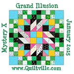
Well hello! I haven't linked up since week two because...well...I'm still stuck on clue 3. I don't know why, but it is going suuuuper slow for me. I've only gotten 90 of the 8 patch units finished.
But the advantage of falling behind is that I get to see whatever everyone else has done with their quilts before I decide what to do with mine! One of the most fun parts of these mysteries is to see how everyone makes the quilt their own.
I spent a loooong time last night arranging and rearranging my blocks in many formations to try to decide what my favorite layout was. I have narrowed it down to two options and would love your help choosing.
Option 1:
I really like how the pinwheels POP with the teal centers and navy edges. I think it makes a a bold, eye-catching statement. And since the pink and teal were my two favorite parts of this color scheme, I had to put the pinks in the cornerstones. But the big disadvantage of this design is that you lose the double diamond impact of Bonnie's original.
Option 2:
I think the pinwheels make less of a wham bang with the pink next to the teal centers instead of the navy, but this way you can see the secondary design of the diamonds formed by the navy lines. This is very similar to Bonnie's layout.
So, what's your vote? You have to squint and stand 20 feet from your computer before you decide! I might have to whip up some mock-ups in photoshop of how each design will look with the full number of repetitions.
And go check out all of the other quilts! There is so much inspiration as many tops are complete! As always, thanks to Bonnie for putting this wonderful design out there for free. I know it can be a big headache for her with SO MANY participants, but it sure is a blast for all of us!


Assuming you are making a quilt of 12 blocks or larger, I would go with the second option, because that navy secondary design makes the whole top flow together. The "blocks and sashing" effect is very strong in your first option, but I prefer the way the blocks blend together in the second option. Just my opinion. Either way, your colors are fantastic and the project is going to turn out great!
ReplyDeleteI like Option number two better. I Just love your colors!
ReplyDeleteLike you say the center block really pops in block 1... but overall I like block 2 and being able
ReplyDeleteto see the secondary design. Great color choices!!
I prefer option #1 because the dark fabrics are not touching & causing that weird, "not matched up" seam look where the sashing and the blocks meet.
ReplyDeleteI like the colors that you used in your blocks. . . . and the final result should be wonderful.
great job. Love your colors either option works for me just do whatever makes you happy!!
ReplyDeleteI may be in the minority here, but I like option one the best. I like the pinks on the outer edges as they makes the design easier on the eye.
ReplyDeleteI REALLY LOVE the first one. I can't say why, but it really appeals to me.
ReplyDeleteLove your colors, those orange cornerstones really tame down the block. I look forward to your final layout.
ReplyDeleteYou have probably decided which you like best by now, but I like the first one. I love your colours, either way!
ReplyDeleteHI Heather, your quilt is so pretty, in whichever arrangement you choose. We love the pink and teal together with the green. What a fun project !
ReplyDeleteBest wishes, from Marina and Daryl