Pages

Wednesday, May 28, 2014

Michael Miller Challenge Progress


The Modern Quilt Guild is currently hosting a fabric challenge, sponsored by Michael Miller. It's a rather clever concept for the fabric company. Each person gets a packet of six fat eighths and are only allowed to use solids or other Michael Miller fabrics. So of course Michael Miller ends up selling a lot of fabrics because you can't do too much with only six fat eighths. :)

Courtesy of MQG

This is the first challenge I've ever done. The MQG also hosted a Riley Blake challenge in the fall/winter, but the fabrics were completely uncoordinated to my eye, and I was too intimidated. But this time all the fabrics are from one line and share like colors, which makes things easier for a challenge newbie like me.

I've also never made a "modern" quilt, and I've made almost nothing without a pattern. I've done one or two variations on patterns, but that is it. So my first idea was to make an animal, but in a geometric shape. I have a good collection of clipart so I picked one I liked and tried to map it out in half square triangles.
I gave up before I got too far on this guy.

This is supposed to be a cool modern cat. Can't you tell?

This did not work at all. Really what I was going for was exactly this quilt at Quilt Market:

But I didn't see this pic until after! Also it takes far more creativity than I have right now. Somehow in this process I was randomly digging through my stash and discovered a small monochromatic jelly roll that I won in my guild's December raffle. I decided to make a background of diamonds from the jelly roll.


My original plan was to replace a few random diamonds with colored diamonds, but I just didn't get around to it. Given that the diamonds are made by strip piecing, it would not have been a super easy substitution.

So then I clicked through my clipart collection and found this little kitty.


The bold lines and limited palate make it a perfect candidate for fusible web applique. I colored it in to approximate the challenge fabrics and here is what I got:


Next step: making it in real life!

In case you haven't heard, don't buy Joann's jelly rolls. This fabric feels like burlap!
One thing I didn't realize was how long and thin my final product would be. I had two strips of each shade and I should have layered them vertically instead of adding them to each other horizontally. But this is improv! We are going with the flow!

Background ready to go!
Here is kitty enjoying her monochrome home. My boyfriend said I should name it "catnip" since she is all psychedelic. We'll see.

And if yout are wondering why kitty is backwards...because I forgot you have to reverse the pattern for fusible web!
Then I let it sit for a while. I originally wanted to do a flower garden with the challenge fabrics, then I though maybe some fireworks and just fun random shapes. As chance would have it, I also won a cricut die cutter at my guild raffle, so I decided this was the time to give it a whirl.

I tried some random configurations before getting to this:


I was thinking of "Color of the Wind" in Pocahontas. Like this!


And I had so much fun with the die cutter, and my boyfriend said make it a swirl, so what the heck!


Much more busy :)

Pro tip: peel the backing paper off BEFORE putting all your little pieces perfectly into position. It took me a while to get these all ready for ironing.

And of course Miss Pepper had to help during the trimming. She literally jumped onto the sewing table and sprawled out like this as I was trying to trim!


Even throwing fabric over her head would not convince her to move. I finally distracted her with a bouncy ball.


Aaaaand all trimmed up! I'm not sure if it's "modern" enough, but I like how it turned out and it was a fun excuse to use some of my new toys. Now to figure out how to quilt it...


Monday, May 19, 2014

Thoughts on the Price of Quilts

So this is one of those posts with no photos. I'm just going to toss in some random fun photos to keep it interesting, ok?
The first quilt I've tried to assign a value to. Apparently nobody thought it was worth $50 but me.

Two weeks ago I went to an art fair. Not a craft fair, but an Art Fair. All of the vendors considered themselves true artists, there were awards granted, and everything was priced as Art should be. There was also a booth of quilted Art. I walked through it, examining the quilts as a quilter does, and started fuming. All of the quilts were variations on sixteen patches. All were stippled using metallic thread and bobbin work. All had machine stitched bindings. I would have taken photos, but it would have also been rude. So just imagine with me. The price tags on these ranged from about $200 for a very small wallhanging (maybe 2' x 3') to over $1,000 for a large wallhanging, maybe 5' x 8' or 9'. So I examined these quilts and got more and more angry. Yes, they were nice quilts. Yes, they were artistic. Yes, the sixteen patches were sewn with nice straight lines. But the machine binding stitches had failed to fully catch the binding in some spots and the artist hadn't gone back to fix it. It was sloppy. It bothered me.

This quilt is considered Art. I wonder if the fact that it's mounted on canvas adds to its art credibility.

But here is what really bothered me. Why are these relatively standard wallhangings able to be priced so high just because they are Art? Why are my quilts, or anyone else's quilts, not worthy of that same standard? What elevates a quilt from being a cheap craft item to being a work of Art? And why am I getting mad at this lady? She's just trying to make a living from her quilts, which certainly have their own artistic merits, as any quilt does.

I LOVE this quilt by Judy Mathieson. But because it has a traditional quilting motif, I suspect collectors would not consider it Art. It's not abstract enough! I wonder if it cannot be considered Art if it is made  from a pattern.

I'm not the only one who's been thinking about these questions. If you are not familiar with the "We are $ew Worth It" campaign, it addresses these issues from the perspective of us "craft" quilters. Sam Hunter argues that we as quilted consistently undervalue our work. She makes a great point. I keep flirting with the idea of listing some of my quilts on Etsy, but it's really hard when so many quilts are available on Etsy for so cheap. I need to at least price my quilts to break even on the cost of supplies (is that so much to ask?) but I swear some of these people are making their quilts from free fabric samples or something because I don't know how they can sell them for so low otherwise! Okay, side rant: I follow a lot of quilt bloggers, some of whom sell their quilts on Etsy. And some of the very same bloggers who cheered Sam's posts (and Molli's subsequent example of true quilt pricing) are THE SAME PEOPLE who are posting quilts for less than $100 online. I don't want to specifically call out people, but a rising tide floats all ships, or however that goes. We ALL have to raise our prices to impact the craft quilt market. And don't act like you support this campaign if you don't actually support it.

Here is Nina's amazing quilt, which challenges the concept of Art and what a quilt should be worth. Visit her website for more closeups of the amazing quilting!

Another perspective comes from Nina Paley, who is apparently a woman of endless talents. If you haven't seen her film Sita Sings the Blues, I highly recommend it. It retells the Ramayana, an Indian epic, from the perspective of the generally passive heroine, Sita. And it's awesome and free online through a creative commons license. So it turns out Nina is also a quilter. She created a quilt designed to look like a $10,000 bill, and has a fantastic post about quilts and art. Her words are so good, I'm just going to quote her:

"High-end art is a form of currency for elites. Art museums and critics encourage us peasants to believe the value in these “priceless art treasures” is based on utility (i.e., the more they cost, the more “genius” they contain). But the value of high end art is due to collectors attaching their surplus capital to it. A million-dollar painting has all the utility of a million-dollar bill. Its value is created not by the artist, but by the collector. When a reputable collector puts a million dollars into a painting, another collector may buy it for more than a million dollars. The art market forms its own economy, with its own financial industry."

...

"Ironically...quilts are among among the most under-valued art forms. They also require more skill and time than almost any other art-making technique I’ve tried. [emphasis added] The selling price of quilts seldom covers the costs of materials; quilters often prefer to give their quilts away. An “expensive” quilt usually costs more than the value of materials, but less than minimum wage for labor. I recently met a master quilter whose beautiful wall quilt, which took months of expert work and won many awards, was professionally appraised at $3,500. This is considered very high; had it not been widely displayed and won many awards, it would be “worth” far less."

...

"Is it because quilts have so much utility (“use-value”) that they can’t get traction as high art? Is it because quilting is historically “women’s work”? Is it because quilting is often kitschy, popular in the middle-class Midwest that many aspiring art-worlders move to New York to get away from? Is quilting too white? (The now-famous Gee’s Bend quilters would be an exception to prove this rule.) Is it because many quilters are insane about copyright, going out of their way to restrict knowledge of their work?"


Right? RIGHT? You tell it, Nina. She hits the nail on the head, but I think her blog doesn't have as broad a following in the quilt world because she does so many other arts as well.  Otherwise we would all be talking about her $10,000 quilt! Guys, go follow Nina's blog! She speaks exactly what is in my mind. Why are quilts not art? Why are some quilts considered art and others aren't?

Okay, I could go on about this forever, but what do you think? Do you sell your quilts? Have you ever thought about pricing them? Have you seen expensive quilts? Cheap quilts? "Art" quilts?

Saturday, May 17, 2014

Finally, A Finish!

I have been composing blog posts as I lie in bed at night, but somehow never sitting down to write them. This finish is a number of weeks old, but at least it's finally done! And at least I'm finally posting about it!

This is the Stairway to Cat Heaven 2. I stopped work on it well over a year ago. It was crazy to pull it out and see just how close I had come to finishing. I already had all the fabric, including batting, backing, and binding. All I needed to do was throw on the borders and stitch it up. I left the photo uncropped so you can see Pepper in the corner admiring it :)

It's interesting how different cameras can distort colors in different ways. I took these with the fancy camera and somehow the quilt came out looking really drab. I promise, the blues are not that gray! Below is the backing, showing some of my quilting swirls. I saw this fabric in the store and instantly knew it was what I needed for the quilt. Despite what the photo implies, it's actually black kitties on a black background.


For the border, I stitched interconnected stars.

All of the quilting is a more simplified version of the quilting I did on my last version of this quilt, because I wanted to get this out the door. These are those loops that are supposed to form circles if done right...obviously I didn't.

Here's a shot of the sky. I just did big swirls all over it. I have to say, I love quilting swirls! I think I'm pretty good at them and they fill the space quickly while looking good at the same time.


For the inner border I just did little loops.

I already gave the quilt to my friend so it can keep her comfy while she recovers from her injuries. She is a real lesson in positivity. Every day I read her inspirational and motivational facebook posts to perk myself up.

And to finish, here's a cute picture of Pepper sitting in my fabric box. I've been buying a lot of modern fabrics lately, so I am overgrowing my current boxes. I will have to do some reorganizing to get everything to fit!


Thursday, May 1, 2014

More thoughts on Paducah quilts

Okay today I went through my Paducah photos and pulled quilts that I had comments on, either about their composition, technique, and so on. This is just a subset, I will probably have a few more of these posts! So, in no particular order...

First off, while every quilt in the show had impeccable quilting, I was surprised by how few really blew me away with the quilting design. This was really the only one where I was floored by way the quilting took a more plain quilt and turned it into a show stopper.  Click the photos to enlarge, you won't be disappointed!
 
"Evening Bloom" by Thelma Childers, quilting by Judi Madsen.


Seriously, wow. I don't know how you manage such perfectly aligned straight lines behind and between all that applique.


This next one was quite unique for its use of ombre. It looks like my flash went off and washed out part of the quilt, but that's actually how it looked! I'm not sure that I like it, but I also don't hate it. I'm just not sure what effect the artist was going for since the pale portions don't form a consistent design or anything. I bet she was going with her heart and gut instinct. :) "Wrought" by Margaret McDonald.


Now there were a few quilts in the show that struck me for their use of what I would consider ugly fabrics. In fact there was one that really blew my mind at the National Quilting Museum, but photos are not allowed there. Here is a shot of it from Quilt Index:


It's calle Joie de Vivre by Candy Goff and won Best in Show in 1999. I wish I could show you a close-up, but you will have to trust me that all those bright beautiful fabrics were actually pretty dull and old-fashioned designs. I was blown away when I got up close to it.  So I definitely saw some quilts like this at the show as well. 


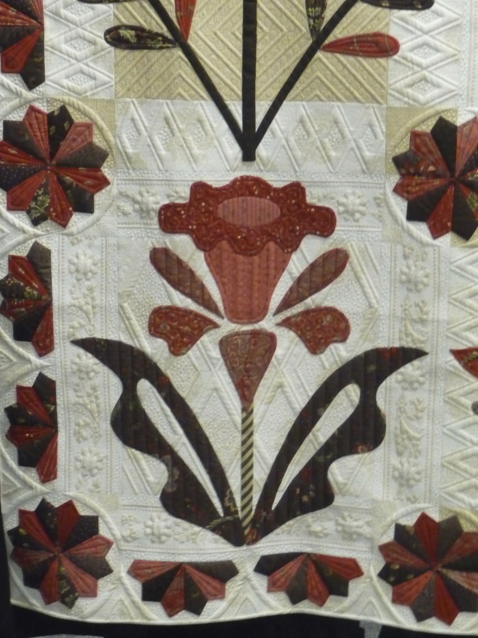
This one is obviously gorgeous, but when you get up close that fabric is pretty old-fashioned florals that I probably wouldn't consider for a quilt. This one is "A Truly Feathered Star" by Karen Sievert.


And here is another one. Beautiful, right?


Check out the close up below. Each of those fabrics are ones that I would consider pretty ugly on their own.  Now this isn't meant to be a negative on these quilters - it's a real complement how they are able to make such amazing compositions such that the fabric's best qualities stand out. It really is amazing! This is "Song of the Earth" by Etsuko Uto.


Okay now this is just on I wanted to share because it's such a neat optical illusion. This is one where I would have liked some details in the program about how she did it. Are the bubbles just painted on top? I don't know! This is "Sedona Dew" by Colleen Wise.


Now I'm going to share a few quilts that I was not a fan of. This one below is just a twister quilt. The pattern itself is pretty bland and the colors are equally blah. The reason it got in , in my opinion, is that she hand satin stitched around EVERY SEAM. But WHY?? It doesn't enhance the quilt to me. I would have not put the time and energy into something like that. Unfortunately I didn't include the label in my photo so I cannot tell you who made this.


This one is lovely, but look at the photo up close and the red and green plaid basically makes you go cross-eyed. Otherwise It's pretty darn awesome. And I don't think I noticed that plaid at all when I was actually at the show, only when looking at the photo later. This is "Cheers!" by Kyoko Inagaki.

This one got an award for impeccable workmanship...but those colors...aside from the fact that they are a bland grey, they are all so similar to one another that you can't actually see the designs in each block. This is another one where I can't really fathom putting the time and effort in if your work can't be appreciated! This is "Oriental Puzzle" by Hitomi Kanazawa.


And this was this year's Best in Show, which you have already probably seen around the internet. The details are really amazing, but what I don't like about it is that it looks a lot like a fabric or design from Provence, so much so that it's look printed to me. It's hard to describe, but somehow it just doesn't look as incredibly detailed as it actually is to me. I guess, it reminds me of a tablecloth. And it's totally sacrilege for a quilt with that much time and effort to be even thought of in the same category as a tablecloth, but I can't help it. This is "Elated" by Ted Storm.


Here's just one close-up showing the details..hand quilting, embroidery on each piece, and so on.


Okay now we are back to some quilts that I did enjoy! This was another one where I thought the colors were bland, but at least this had a purpose: It depicts snowy winter scenes. And since I've been dreaming of making a snowglobe quilt, the snowglobe theme of this got me pretty excited. This is "Snowy Town" by Hiroko Suzuki.


I was surprised at how few Baltimore quilts were in the show. There were a few, but I was expecting more. There were a lot of hand applique quilts that were more medallion-style. Anyways this one stood out because somehow she was able to make everything look so three dimensional. This is "Sleigh Ride" by Michele Byrum and Laurel Keith.


Check out the close-up below. Are those flowers painted? Do hand applique artists just have amazing abilities to find perfectly shaded pieces of fabric? Seriously, this boggles my mind. It looks so good!

Here's another close-up. I wasn't a complete fan of the quilting. The quilter tried to create a secondary design with the blocks in which she quilted curves, but to me it just came out looking like she got sick of making curves and stopped part of the way through. But look at that shading on those petals! Do they just find ombre fabric??


Okay this one both annoyed me and made me sad. The quilter put a heck of a lot of time and effort into making this Hawaiian quilt, but made one glaring mistake. Can you see it?


Okay, aside from the colors, which I find rather garish and clashing, she picked a partially see-through fabric and didn't line it, so the seam down the center is just completely obvious and glaring. It's a shame to have a quilt with some much time and effort in it have such a basic mistake. I am sure she sewed the two pieces together before she did much sewing down, so I'm surprised she didn't just correct it then. This is "My Favorite Quilt" by Machiko Kunimoto.


Okay we can't end on that depressing note, so here is a fun one for you:

All of the amazing designs on these blocks were thread painted. Some of the tan shading looks like it may be fabric paint, but everything black is thread. They look like sketches, don't they? I didn't really such much thread painting at this show at all, so this quilt was a real treat. This is "The Value of Gears" by Judith Phelps. Check out Mr. Moon!