Pages

Saturday, May 17, 2014

Finally, A Finish!

I have been composing blog posts as I lie in bed at night, but somehow never sitting down to write them. This finish is a number of weeks old, but at least it's finally done! And at least I'm finally posting about it!

This is the Stairway to Cat Heaven 2. I stopped work on it well over a year ago. It was crazy to pull it out and see just how close I had come to finishing. I already had all the fabric, including batting, backing, and binding. All I needed to do was throw on the borders and stitch it up. I left the photo uncropped so you can see Pepper in the corner admiring it :)

It's interesting how different cameras can distort colors in different ways. I took these with the fancy camera and somehow the quilt came out looking really drab. I promise, the blues are not that gray! Below is the backing, showing some of my quilting swirls. I saw this fabric in the store and instantly knew it was what I needed for the quilt. Despite what the photo implies, it's actually black kitties on a black background.


For the border, I stitched interconnected stars.

All of the quilting is a more simplified version of the quilting I did on my last version of this quilt, because I wanted to get this out the door. These are those loops that are supposed to form circles if done right...obviously I didn't.

Here's a shot of the sky. I just did big swirls all over it. I have to say, I love quilting swirls! I think I'm pretty good at them and they fill the space quickly while looking good at the same time.


For the inner border I just did little loops.

I already gave the quilt to my friend so it can keep her comfy while she recovers from her injuries. She is a real lesson in positivity. Every day I read her inspirational and motivational facebook posts to perk myself up.

And to finish, here's a cute picture of Pepper sitting in my fabric box. I've been buying a lot of modern fabrics lately, so I am overgrowing my current boxes. I will have to do some reorganizing to get everything to fit!


Thursday, May 1, 2014

More thoughts on Paducah quilts

Okay today I went through my Paducah photos and pulled quilts that I had comments on, either about their composition, technique, and so on. This is just a subset, I will probably have a few more of these posts! So, in no particular order...

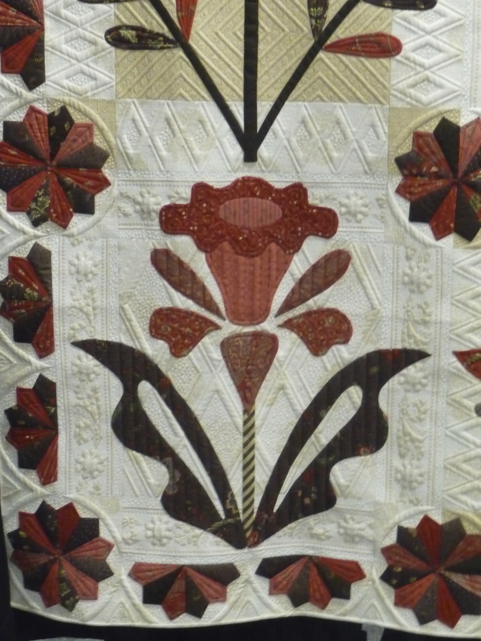
First off, while every quilt in the show had impeccable quilting, I was surprised by how few really blew me away with the quilting design. This was really the only one where I was floored by way the quilting took a more plain quilt and turned it into a show stopper.  Click the photos to enlarge, you won't be disappointed!
 
"Evening Bloom" by Thelma Childers, quilting by Judi Madsen.


Seriously, wow. I don't know how you manage such perfectly aligned straight lines behind and between all that applique.


This next one was quite unique for its use of ombre. It looks like my flash went off and washed out part of the quilt, but that's actually how it looked! I'm not sure that I like it, but I also don't hate it. I'm just not sure what effect the artist was going for since the pale portions don't form a consistent design or anything. I bet she was going with her heart and gut instinct. :) "Wrought" by Margaret McDonald.


Now there were a few quilts in the show that struck me for their use of what I would consider ugly fabrics. In fact there was one that really blew my mind at the National Quilting Museum, but photos are not allowed there. Here is a shot of it from Quilt Index:


It's calle Joie de Vivre by Candy Goff and won Best in Show in 1999. I wish I could show you a close-up, but you will have to trust me that all those bright beautiful fabrics were actually pretty dull and old-fashioned designs. I was blown away when I got up close to it.  So I definitely saw some quilts like this at the show as well. 


This one is obviously gorgeous, but when you get up close that fabric is pretty old-fashioned florals that I probably wouldn't consider for a quilt. This one is "A Truly Feathered Star" by Karen Sievert.


And here is another one. Beautiful, right?


Check out the close up below. Each of those fabrics are ones that I would consider pretty ugly on their own.  Now this isn't meant to be a negative on these quilters - it's a real complement how they are able to make such amazing compositions such that the fabric's best qualities stand out. It really is amazing! This is "Song of the Earth" by Etsuko Uto.


Okay now this is just on I wanted to share because it's such a neat optical illusion. This is one where I would have liked some details in the program about how she did it. Are the bubbles just painted on top? I don't know! This is "Sedona Dew" by Colleen Wise.


Now I'm going to share a few quilts that I was not a fan of. This one below is just a twister quilt. The pattern itself is pretty bland and the colors are equally blah. The reason it got in , in my opinion, is that she hand satin stitched around EVERY SEAM. But WHY?? It doesn't enhance the quilt to me. I would have not put the time and energy into something like that. Unfortunately I didn't include the label in my photo so I cannot tell you who made this.


This one is lovely, but look at the photo up close and the red and green plaid basically makes you go cross-eyed. Otherwise It's pretty darn awesome. And I don't think I noticed that plaid at all when I was actually at the show, only when looking at the photo later. This is "Cheers!" by Kyoko Inagaki.

This one got an award for impeccable workmanship...but those colors...aside from the fact that they are a bland grey, they are all so similar to one another that you can't actually see the designs in each block. This is another one where I can't really fathom putting the time and effort in if your work can't be appreciated! This is "Oriental Puzzle" by Hitomi Kanazawa.


And this was this year's Best in Show, which you have already probably seen around the internet. The details are really amazing, but what I don't like about it is that it looks a lot like a fabric or design from Provence, so much so that it's look printed to me. It's hard to describe, but somehow it just doesn't look as incredibly detailed as it actually is to me. I guess, it reminds me of a tablecloth. And it's totally sacrilege for a quilt with that much time and effort to be even thought of in the same category as a tablecloth, but I can't help it. This is "Elated" by Ted Storm.


Here's just one close-up showing the details..hand quilting, embroidery on each piece, and so on.


Okay now we are back to some quilts that I did enjoy! This was another one where I thought the colors were bland, but at least this had a purpose: It depicts snowy winter scenes. And since I've been dreaming of making a snowglobe quilt, the snowglobe theme of this got me pretty excited. This is "Snowy Town" by Hiroko Suzuki.


I was surprised at how few Baltimore quilts were in the show. There were a few, but I was expecting more. There were a lot of hand applique quilts that were more medallion-style. Anyways this one stood out because somehow she was able to make everything look so three dimensional. This is "Sleigh Ride" by Michele Byrum and Laurel Keith.


Check out the close-up below. Are those flowers painted? Do hand applique artists just have amazing abilities to find perfectly shaded pieces of fabric? Seriously, this boggles my mind. It looks so good!

Here's another close-up. I wasn't a complete fan of the quilting. The quilter tried to create a secondary design with the blocks in which she quilted curves, but to me it just came out looking like she got sick of making curves and stopped part of the way through. But look at that shading on those petals! Do they just find ombre fabric??


Okay this one both annoyed me and made me sad. The quilter put a heck of a lot of time and effort into making this Hawaiian quilt, but made one glaring mistake. Can you see it?


Okay, aside from the colors, which I find rather garish and clashing, she picked a partially see-through fabric and didn't line it, so the seam down the center is just completely obvious and glaring. It's a shame to have a quilt with some much time and effort in it have such a basic mistake. I am sure she sewed the two pieces together before she did much sewing down, so I'm surprised she didn't just correct it then. This is "My Favorite Quilt" by Machiko Kunimoto.


Okay we can't end on that depressing note, so here is a fun one for you:

All of the amazing designs on these blocks were thread painted. Some of the tan shading looks like it may be fabric paint, but everything black is thread. They look like sketches, don't they? I didn't really such much thread painting at this show at all, so this quilt was a real treat. This is "The Value of Gears" by Judith Phelps. Check out Mr. Moon!


Wednesday, April 30, 2014

My Favorite Paducah Quilts

There are so many gorgeous quilts at a big show...every quilt has to be pretty amazing to even be juried in. So in all that greatness, it's sometimes hard to pick favorites. For me, the favorites were the ones that had something unique, that led me to remember them through the whirlwind of all the amazing quilts I saw.  A lot of why these quilts stood out to me is related to my current quilting interests and passions. So here are some of my top choices and a little bit about why:


This is called "Four Loons and Friends" by Patricia Sellinger. Unfortunately my photo is a little blurry. Also unfortunately, somebody pinned a ribbon right on top of one of the ducks! I wanted to go right up to the quilt and move it. Seriously, who did the ribbon pinning?


Here's a close up of the center that came out less blurry. I like this quilt because it combines some elements of a traditional medallion sort of design with some fun applique elements. I am definitely on an applique kick right now but an all-applique quilt can be overwhelming to look at with just so many details. I like how this has a smaller number of appliques with a fun theme and a consistent color scheme. Plus I love that each of the ducks is a different species. It has fun elements to keep you looking but doesn't blow you away with intense detail.  I am a fan!


 This is called "Ancient Sentinel" by Valerie Sauban. I actually saw a photo of this online a few months ago and saved it for inspiration because it was so striking. Elements that make this amazing:

  • The colors. I love how the color scheme incorporates the purple and bright blue
  • The simplicity of the scene. The lone tree packs a punch. Your eye isn't trying to figure out where to land here!
  • The internal element that overlaps onto the border. I've tried to do this myself once or twice and it's technically rather hard, at least for me. But it sure looks cool.


Another completely awesome element was the quilting. There were sheep quilted all over the sky. They were something you only noticed when you gave the quilt a close look.


This photo is blurry, but a lovely flower was quilted in behind the skull. This quilt had a lot of fun treats for those who took the time to give it a closer look!

Okay more Paducah posts soon!

Tuesday, April 29, 2014

Hello Paducah!

This weekend I had the great pleasure of attending the AQS show in Paducah for the first time. I believe it is just behind Houston as the largest quilt show in the US. It was a ton of fun and I will probably split up photos into multiple posts.

I completely lucked out on the ride down because I got to sit next to Casey York! It's so fun to talk to others about quilting and this is the first time I've gotten to chat up someone who's blog I follow. It was a blast and I hope I can get to know others whose blogs I follow soon too :)

I got to see Christa Watson's quilt in the (very small) modern quilt section. Go Christa!
For this post I'll just focus on some general impressions of Paducah. These are generally all in comparison to Pacific International Quilt Festival (PIQF), which is the only other large quilt show I've been to. First off, Paducah had fewer quilts but waaaaay more vendors. I most definitely ran out of time to do everything I wanted and I had to skip out of the vendor tent early to ensure I actually made it to all the quilts.

Second, this show was definitely more traditional than PIQF. There were far fewer pictorial/art quilts and more traditional patterns. There was quite a bit of hand applique. All of the traditional quilts had a serious "wow" factor, but I have a passion for landscape quilts so I wish I could have seen more.
Lots of big and bold medallion quilts like this one by Masa Yanagimoto (btw there were also a ton of quilts by Japanese quilters. That's a whole nother post!)

One thing that was a little frustrating was that you could not get close to the quilts. A lot of this quilts shined because of their amazing details, and unfortunately you just can't see those details from 6 feet away. Some quilts are really also meant to be viewed head on, and with the  chain you just couldn't do that.
Curse you, chain!

This quilt by Lorrie Hockett just begged to be viewed close up...but you couldn't! It was almost a travesty. I would have loved to found all of the fun details hiding in it.

I took close-ups of all of the blocks on that quilt so I could actually seem their contents!

This one needed to be viewed head-on for full effect. This angled picture doesn't provide  the impact that I know this quilt has. Quilt by Kathy McNeil.
Okay one more whiny point: the quilt descriptions were mighty short. Each quilt had merely a number next to it and you had to look up the number in the program. It seems each person was limited to about 100 characters for their quilts description. Almost none included a listing of the techniques used, which is typical in other quilt shows I attend. That's information I would like to know!

Criticisms aside, there were a lot of pretty flipping awesome quilts. I did one round of the show taking photos and a second round just taking in the quilts and enjoying them without the camera distracting me. It's fascinating how some quilts look awful up close and when I look through the camera lens they look completely different.

Take this quilt by Jo Ann Kilgroe and Jessica Jones Gamez. It wasn't until after I had been snapping a few photos of it that I realized the flowers in the corners were actually butterflies!


Okay that's enough photos for now. I probably be posting a lot more with some specific observations about use of fabric, color, quilting, and so on. It's always great how much you can learn and be inspired at these shows!

Wednesday, April 16, 2014

Kitties! Quilts! Kitty Quilts!

Sew many fun things have been happening around here!

First off, a surprise came in the mail!


It's a quilt rack! Thanks Mom! Right now it only has two quilts on it but as the weather warms more quilts will transfer from my bed over to the rack. As you can see, my kitty quilt seriously needs to be ironed after being folded up in the closet so long! It's great to have a place to keep quilts out and about instead of hidden away when not in use. :)

I also got another treat in the mail, although I knew this one was coming...fabric!

I joined a fabric of the month club that focuses on modern prints. I wanted to join back in Jan but they were full. They finally recently reopened membership and I jumped on the chance to join.  I normally don't buy fabric without a plan, but these modern prints are out of my comfort zone, which is precisely why I wanted to join the club. 


I foresee a lot of fun modern quilts in my future with all of these fun fabrics! Every month the club focuses on a different color, and as you can see, this month was yellow.


This one is a favorite. Look at those bicycles! Too cute!

In other news, actually sewing has, believe it or not, been occurring as well.  I am finally making real progress on the embroidery on my veggie quilts (photos coming...sometime)...and was for a while focused on finishing up the bear and salmon quilt. Then, a friend got seriously injured. And folks, just a PSA here, please get health insurance. Because you never know when you will fall down the stairs and break both your legs in a freak accident. And if you don't have insurance, like my friend, you are looking at a pretty scary hospital bill. 

So I was thinking of how to help and it hit me that I have a number of nearly finished tops lying around my house and this was the perfect chance to finish one. So...remember this quilt?


It's a duplicate of my Stairway to Cat Heaven quilt. It was kind of a commission via the internet and of course the person disappeared off the face of the planet...so this got folded up for another day. But all it needed was some kitties and a border...and I had all of the fabric, including backing and batting, on hand!

Of course I didn't take any photos, but I whipped up the top in no time (with a simplified border from the one I made for myself) and tonight got is about halfway quilted.  Basting was a breeze with my awesome new quiltak gun, although I got some lumps in the batting through my own fault.


Miss kitty was all about helping...in the worst way! The other day she sat in my lap while I was sewing the borders on and kept poking her paws towards the needle..and I kept jsut about having a heart attack! Today she went out of her way to be in the way while I was trying to quilt. Here I had flipped it over to check out the back and make sure there weren't lumps forming.


You can see the part I've quilted so far. It goes very quickly when there isn't a kitty in the way.


And of course when I turned it upright to do more quilting she made herself right at home! It was at about here that I gave up for the night! I am confident that I can get this quilt finished in another week (or less!) and hopefully get it to my friend to snuggle under while she recuperates. And seriously, please get health insurance guys.

One more kitty shot to take us out:

Awwwwwww...how can you be mad at a face like that?