Pages

Sunday, November 23, 2014

Wrapping Things Up

I've been working here on getting odds and ends finished before Bonnie's mystery starts in a mere 5 days. I have my fabrics chosen and mostly purchased, I need a few more fat quarters in two colorways but otherwise am all set.

I've gotten *most* of my Christmas presents stitched up, can't show you photos of those until after the season. But I also have been working to wrap up my Skill Builder BOM. I'm pleased to say that I have finally caught up!

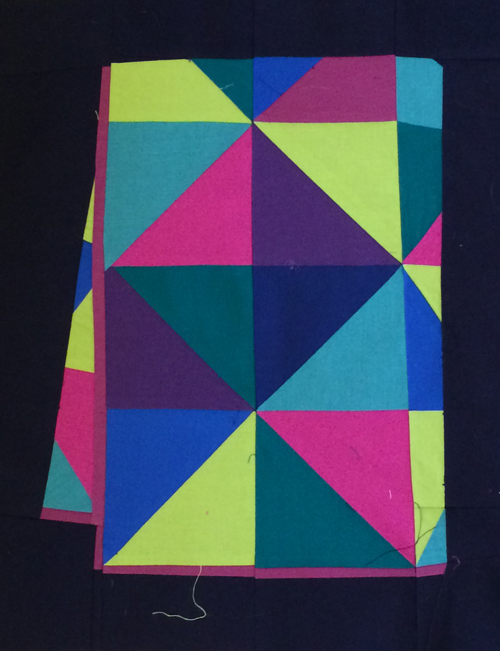
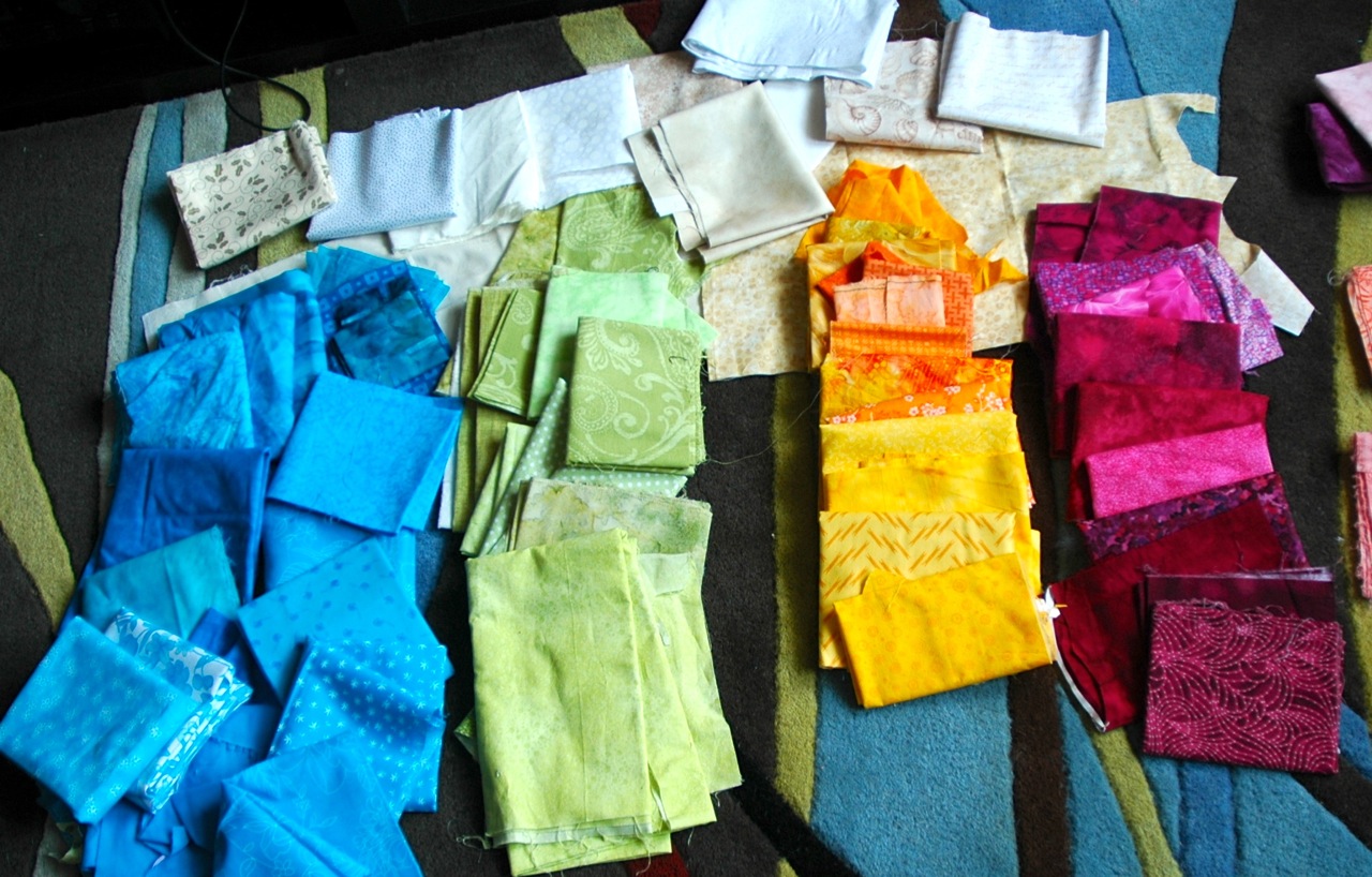
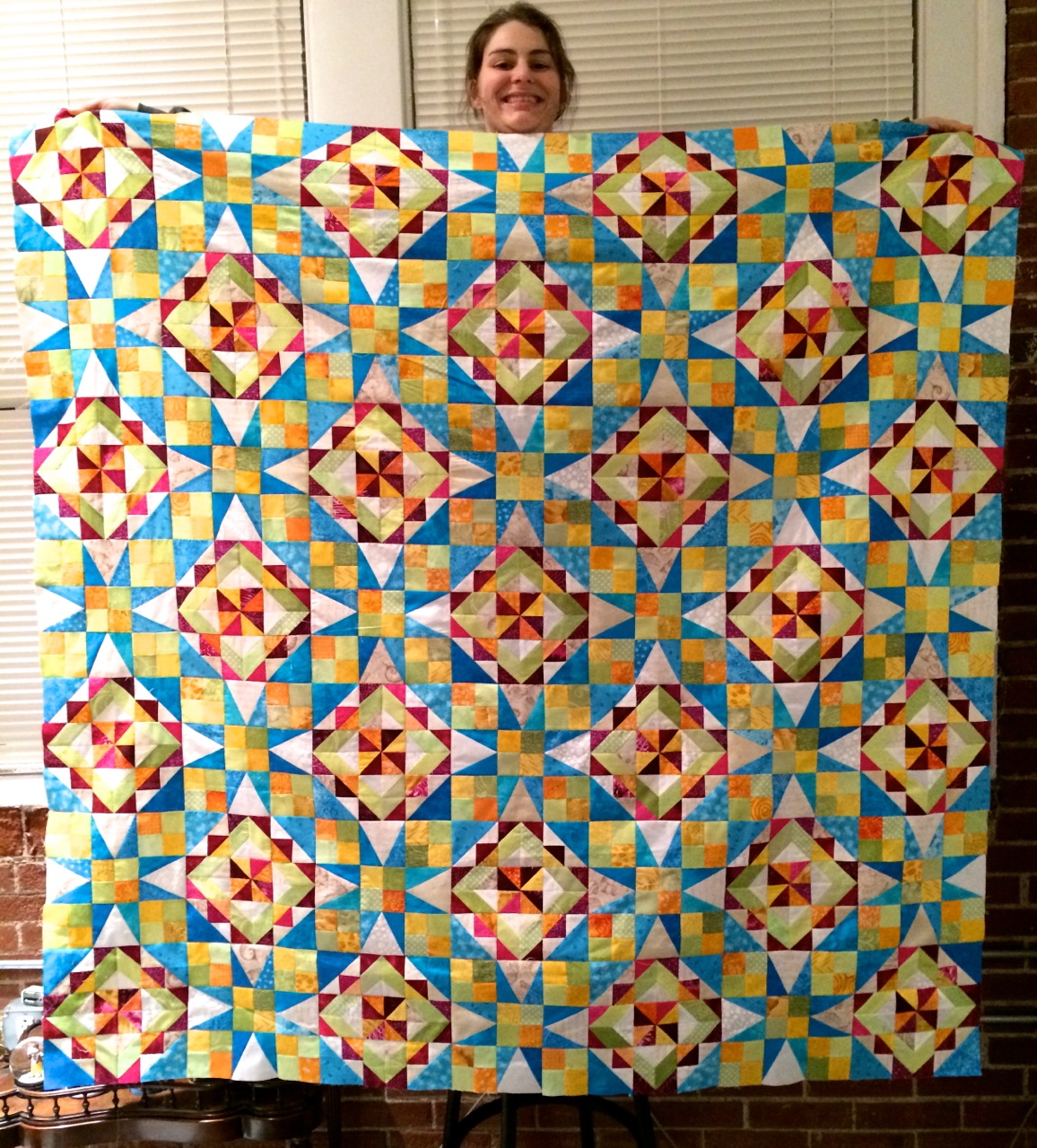
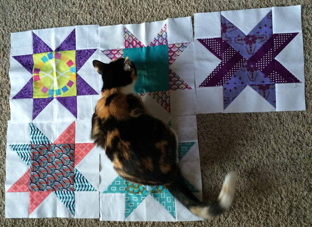
Here are all the blocks laid out together:


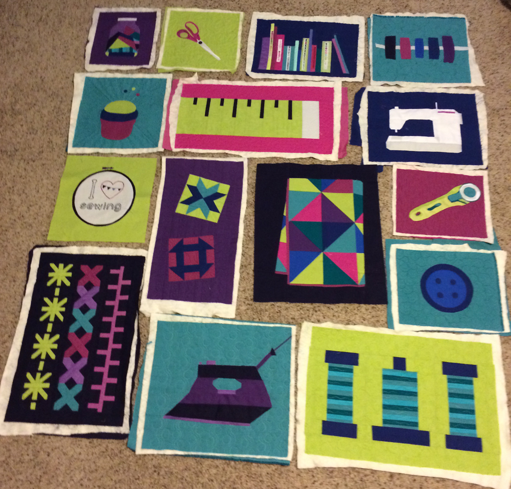
It's exciting to finally see it coming together! I have never done a quilt as you go before, so we will see how smoothly the actual assembly goes. From tutorials I've read online, it looks like a pain. I believe the assembly instructions for this project will be released in December.

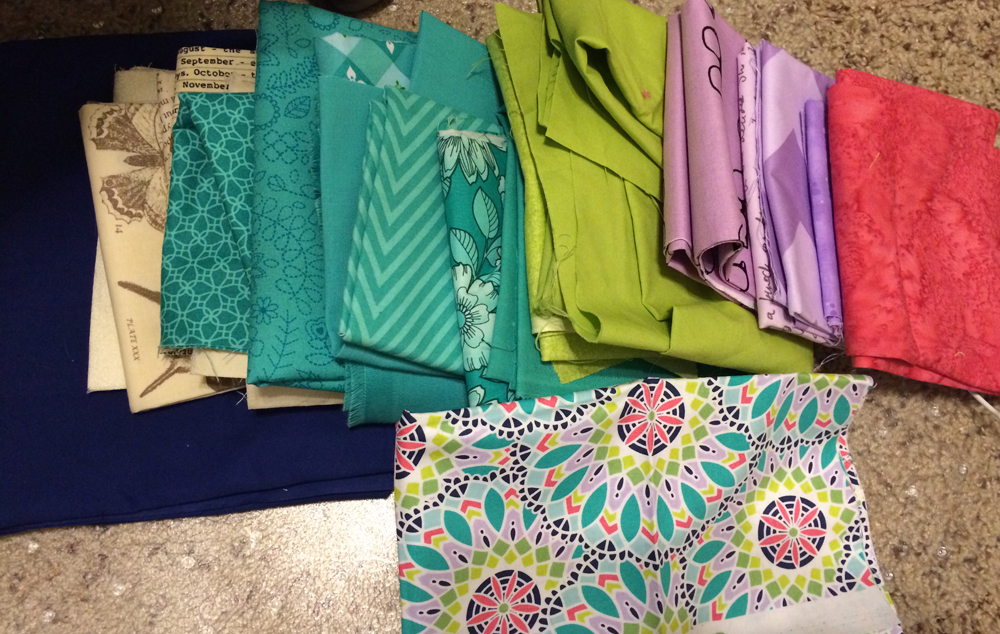
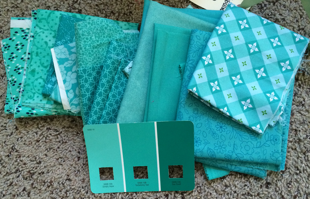
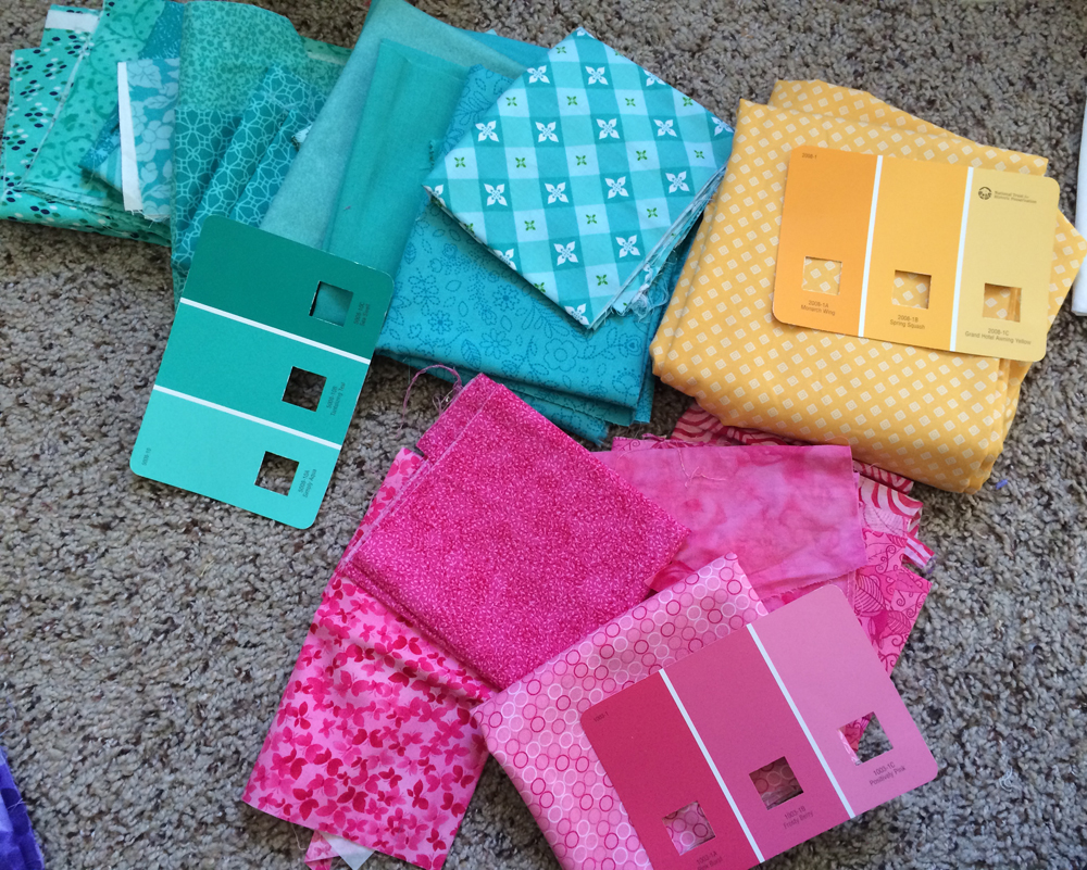
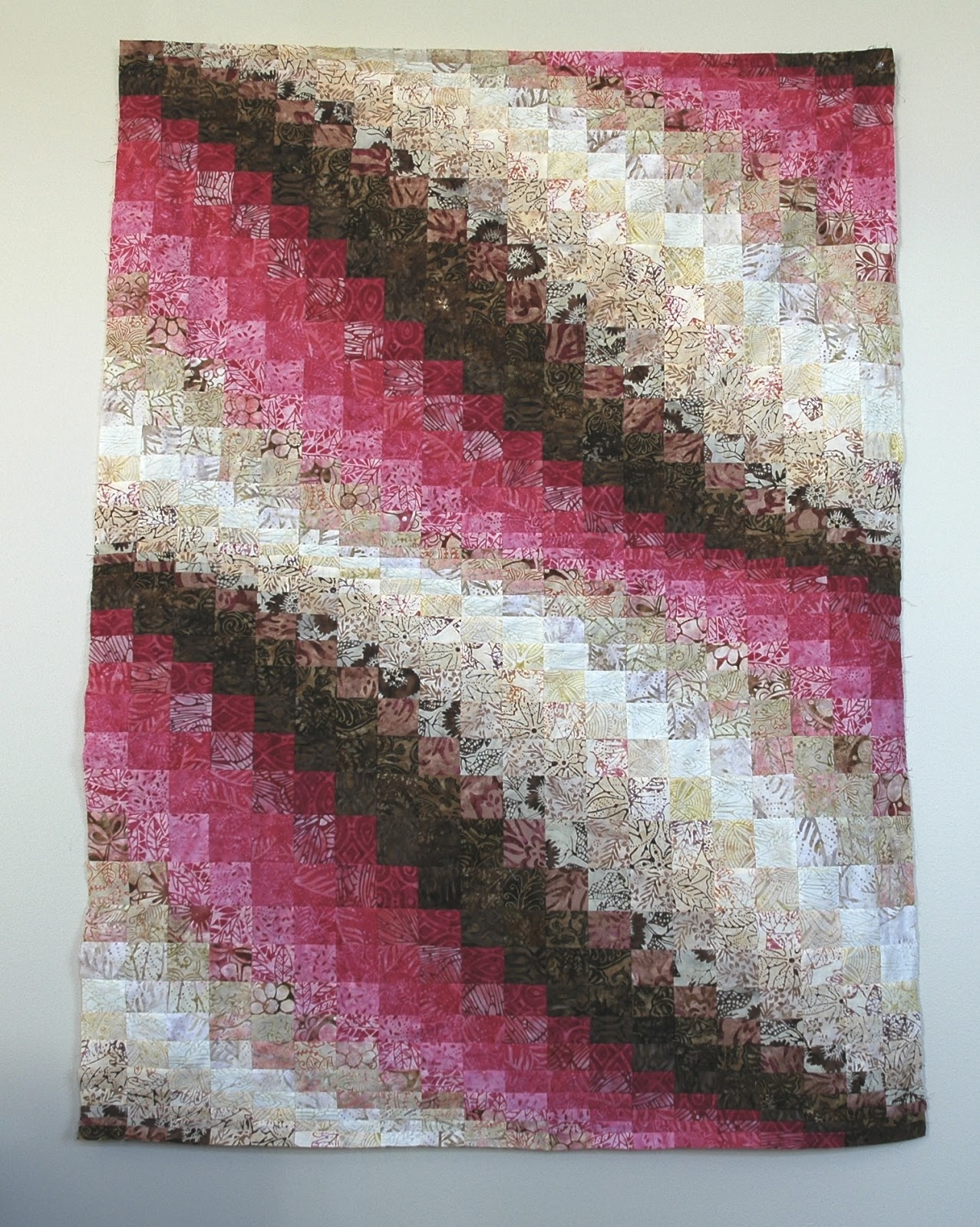
Here are some close-ups of some of the recently completed blocks:

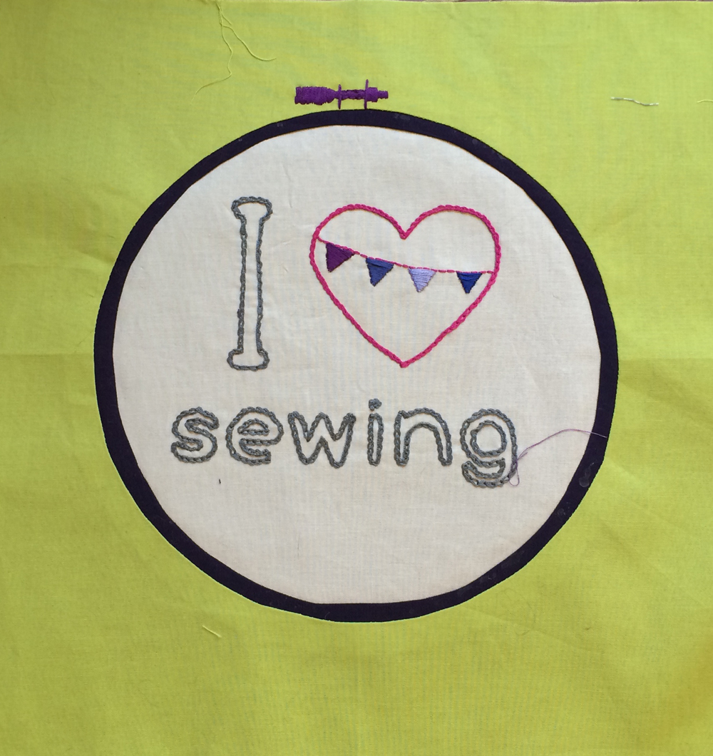
This embroidery block took me forever simply due to the hand stitching. I worked on it very slowly over time while sitting in front of the tv. The circles are made using piecelique, which I like but don't love. You can see glue stains all over the hoop because I am messy. 


Here we have the first paper pieced block, the iron. This block and I did NOT get along.


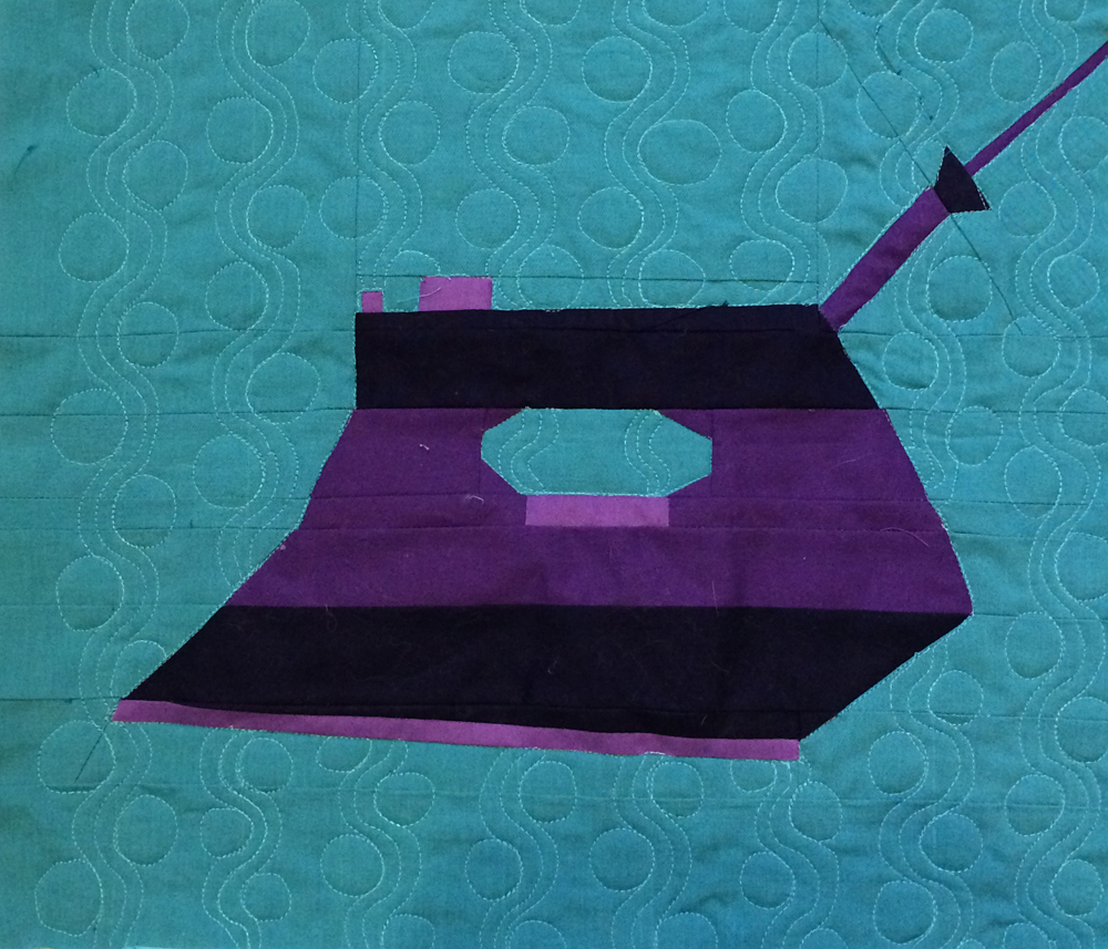
This block was made up of many long, thin pieces, which are very hard to paper piece because they aren't secured to the paper in enough spots. The instructor used freezer paper but you can only do that if you have an inkjet printer, and I have a laserjet so I had to use regular paper.

And then I got about halfway through quilting it and determined that I wouldn't have enough thread to finish the block and didn't want to go on a wild goose chase to try to match the color, so I ripped it all out. Then I was quilting it the second time and this happened:
 So, more ripping ensued. Like I said, this block and I don't get along.

Next came the sewing machine, with much more manageable pieces.

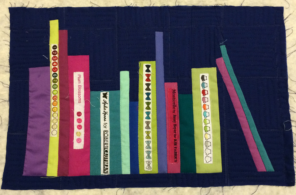
And the bookshelf, which I had a lot of fun with. The pattern called for a glue method that I did not appreciate, so I pieced it.

And finally, the folded quilt. My quilt binding pieces don't match up perfectly but I think it still looks fine.


 Phew! Now, onto my bee block and a few other fun odds and ends before the big mystery begins!


Sunday, November 16, 2014

Final(ish) Color Choices

Okay, after more agonizing and tossing of fabrics all over my floor, I have a mostly complete color scheme. As I previously mentioned, I recently purchased a fat quarter bundle of a line called "geofabulous." I love the bright colors and the way they interact.


I was also intrigued because the pink and teal match Bonnie's color card exactly.  So the other day I sat down with some of these prints and tried to match them. Here is what I came up with:


The bottom flower or mandala print is what the colors are based upon. It got a big thumbs down from my mom but I showed it to the ladies in my guild and they were ok with it.

There are a few remaining questions, and I need to decide the answers fast.
  1. Do I use the lime or lavender as a stand-in for Bonnie's yellow?  The other will replace Bonnie's green. The yellow is a single large print instead of many scraps like the other colors. On the one hand, the lime has that brightness that the yellow has. On the other hand, lime is a shade of green so shouldn't I leave it with the greens and make the lavender the yellow?
  2. As I relooked over the fabric requirements, there are a LOT of blacks and whites in this quilt. They are clearly an important component of the design. To match that fabric line I was trying to go for more beige and navy. But maybe I should stick with black and white. The two options are below.


Beige and Navy:


Black and White:


What do you think? 


Sunday, November 9, 2014

Grand Illusion Color Scheme

I am still pondering away on how to perfect my color scheme for the Grand Illusion mystery quilt.

After getting some initial feedback from my last post, it was clear that at the very least, the greens I had picked were totally wrong. At the least, those will need to change. I decided to start with one color and build from there.

The teals are definitely staying, because I bought a ton of yardage in this shade, specifically for this quilt. I feel like I've done  good job sticking with the color card.


Next I added back in the yellow. I think the yellow and the teal play off each other well.


Next, the pinks. I ditched a lot of the much darker pinks to get back to the color card.


As you can see, the pinks are just a bit too...pink. They need a bit more salmon/coral in them.

Here are all three colors together.

It's ok, but a little too saccharine. But check out how it changes when I slightly swap out the shade of pink:


Much better! The salmon-y shade gives it a little more grit. But here we reach an impass, because as you see, these three colors form a triad.


The above shot is from one of my most well-used books, "Color Play," by Joen Wolfrom. Who by the way has a class on craftsy about color, which I just might have to try. 

So the problem here is we have a trio of colors that go well together, but we need FOUR colors. You can't just toss a fourth color into a triadic color scheme!

Nevertheless, I tried to find the perfect fourth. How about purple? I have seen online that many are choosing to swap out purple for green. This color scheme does not do it for me. It's still too sickly sweet.


How about swapping that yellow for a pale lime?

I definitely prefer this one. What if I go with an even darker lime?


Maybe? I'm not sure how I feel about it. What's funny is I originally rejected those limes but if you swap out the purple for the yellow...


...we are back to Bonnie's original color scheme! Which looks much better now that I have corrected the hues of the pink and green. However, one reason I am hesitant to stick with this color scheme is that it is suspiciously close to the colors that I used for Bonnie's mystery last year!

Here are last year's colors:


I certainly don't need two quilts in the same shades, and for that reason alone I want to mix things up. 

While visiting my local quilt shop last week, I bought a fat quarter bundle from a lovely line called "geofabulous." I noticed that the teal, pink, and green all matched the colors Bonnie had chosen, so I wondered if I could get inspiration from the line. The other primary shade used in that line is a navy blue. Below are four fabrics from the line.


And then when ironing today, I realized that my ironing board cover uses the same color scheme!


Hmmm...think there's something to this?

I tried out the navy FQ with my other colors:

I like that the navy tones down all the super bright and intense shades of the others. However, I am very hesitant to use this color scheme. Last year I accidentally messed up my colors and ended up using pink where Bonnie used yellow. If you look at her quilt, the yellows and whites blend together to form diamonds. If you look at mine (below), that diamond shape is muddied.


For that reason, I am hesitant to swap out a very bright shade like yellow for a very dark shade like navy. I think it could ruin the effect that Bonnie has in mind for her quilt, especially with a name like "Grand Illusion," I bet there are some secondary patterns that will appear in the design.

So we are still up in the air on the colors. At least I have corrected my hues for green and pink. What remains is to find a scheme that is pretty, not too different from Bonnie's, but also not too similar to what I did last year. Tough!

Another Finish

As we are nearing the end of the year, I am FINALLY making progress on my to-do list! It took 11 months, but I am able to check off another project.


Here is my bear bargello quilt! This quil is designed to be a snuggly couch quilt. After hearing a lot of whining from certain people about their feet always sticking out from the bottom of my quilts, I made this one super long. 


In this photo I am standing on a 3 foot stepladder! So there should be no problems with cold toes under this guy!

This quilt started back in California with a simple layer cake.


The layer cake turned into a bargello, which was lovely but too small at about 40".


And from that bargello, we eventually got the quilt you see today!


I'm just glad it's done.  The back is super soft "ultra cuddle fleece" from Joann's. Its almost a faux-velvet feel. After I found the right needle to prevent the back from being pulled to the front (ball point is the solution), I had no trouble sewing with it. It was so smooth that I think it actually aided the quilt in gliding along during my quilting.  And I like how it shows my quilting lines but doesn't show the actual stitches themselves. I stuck with really basic quilting on this in order to keep it fluffy.


And now, onto more projects! Like Christmas presents. I need to get everything done before Bonnie's mystery begins, because once it starts it is important to me to keep up with the clues and not fall behind. I will keep working hard over the next three weeks to get everything checked off my to-do list. The colors for Bonnie's mystery are still being chosen, I'll post more on that soon. For now, the green is definitely out and the teal definitely in. Nothing else is decided.

On another pleasant note, this past month was my turn for our new little bee, which we are calling "New Bee on the Block." We are all new to bees and still figuring it out as we go. Anyways, here are the stars everyone made for me.


These will be a quilt someday, emphasis on the someday! And of course the minute I tried to take a photo my cat said "oh I see you are trying to do something over there, let me get in the way!"


Cats, gotta love 'em!


Friday, November 7, 2014

Fabric Choices

Well I have been staring for many days at my fabrics for Bonnie's Grand Illusion mystery quilt, and something is not quite right. Here is what I've got right now:


The colors aren't great in these photos but I chose to leave them because I want the photos to be comparable to each other...so hopefully all of the colors are screwy by the same amount! 

These colors just aren't speaking to me. They're okay, but I'm not in love with them. And color is totally crucial to a quilt, so if I don't love them now, I doubt I will love them after cutting and sewing thousands of tiny pieces.

So...which color is wrong? The yellow is admittedly not my favorite. I don't normally use a lot of yellows and oranges. So I tried some other alternatives:


I do kind of like how this grey looks, but the color palette stills feels incomplete.


This is actually a very yellow-y lime. I kind of like where it's heading, but we've already got plenty of green and "cool" colors. 

Then I thought, maybe the yellow isn't the problem. I feel like these colors do need some kind of yellow-y hue to tie them together. I have always been bothered by the green and the aqua because to my naked eye they look practically identical. And then when I take a photo of them they look very different. 

So I went ahead and got rid of the green, and put in this nice royal purple instead.
 Hmmm...I like where it's going. How about lime instead of yellow?


I like it! What do you think? I'm going to keep thinking about what I want to do. Luckily the first clue doesn't come out for three more week!