
I was also intrigued because the pink and teal match Bonnie's color card exactly. So the other day I sat down with some of these prints and tried to match them. Here is what I came up with:
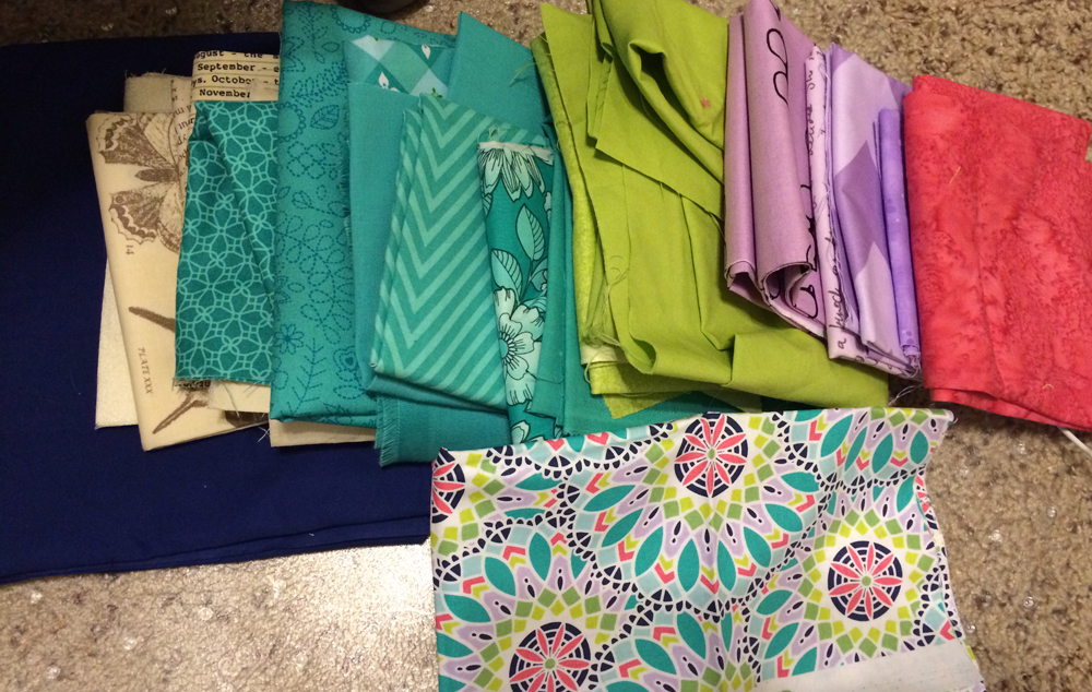
The bottom flower or mandala print is what the colors are based upon. It got a big thumbs down from my mom but I showed it to the ladies in my guild and they were ok with it.
There are a few remaining questions, and I need to decide the answers fast.
- Do I use the lime or lavender as a stand-in for Bonnie's yellow? The other will replace Bonnie's green. The yellow is a single large print instead of many scraps like the other colors. On the one hand, the lime has that brightness that the yellow has. On the other hand, lime is a shade of green so shouldn't I leave it with the greens and make the lavender the yellow?
- As I relooked over the fabric requirements, there are a LOT of blacks and whites in this quilt. They are clearly an important component of the design. To match that fabric line I was trying to go for more beige and navy. But maybe I should stick with black and white. The two options are below.
Beige and Navy:

Black and White:

What do you think?
No comments:
Post a Comment